Hello pards, and welcome back to Company Q Headquarters! It's been a cold, dreary, dark winter in 1865. But the days are getting longer, the life has returned to the land, the muddy roads are drying out, and pretty soon those Johnny Rebs will be fightin' us again. This marks the end of the Sesquiecentennial (sp?) anniversary cycle, and next year we reset the clock back to 1861 and start over with Fort Sumter again.
I have been meaning to write this post for awhile, and I suppose I should do it before all the excitement about our time period dies down.
As a highly skilled, trained and well-versed expert in my chosen field I studied before this dreaded war, (that of a commercial printer), I have been meaning, no...procrastinating on writing this very helpful journal entry. It's on how to design convincing event flyers and recruiting posters for reenactments and reenacting groups, done in a historically accurate style. To this end, I have compiled this series of infographics if you will, of how to do this yourself using desktop publishing software and free fonts, following the Nineteenth Century "Rules" of design.
Before we start, you will need a desktop publishing program. Microsoft Publisher is adequate, but an Adobe program is better. Adobe gives 100% freedom to push, pull, stretch and resize text without any constraint or size limits. And it has none of that annoying "snap to grid" or "margins" that Microsoft Office does. Luckily, Adobe Illustrator and Photoshop are now available for a monthly subscription fee through Adobe Creative Cloud instead of $2,000 for a permanent license. The unregistered 30-day trials can save documents and have full functionality for one month. Don't forget you can also use alternative free publishing programs like Inkscape (vector drawing program) and GIMP (A poor man's Photoshop). These programs are absolutely free, open-source and user supported. Apache OpenOffice is a free clone of MS Office products.
I wanted to start out this unique post by showing a few historical examples of famous Civil War posters.


And here's one I like, a recruiting broadside from the Governor of Pennsylvania proclaiming the mustering in of a new infantry regiment. The unit is known as Kane's Rifles, after its colonel Thomas Leiper Kane. This was officially named the 42nd Pennsylvania Infantry, the "old bucktails"...my unit!


For the more serious typesetter who would like to see some really high quality premium Civil War fonts and pay some money, you can click on the link below to be taken to an online store where you can purchase the sets of type. I highly recommend WALDEN FONT CO. as the best source of accurate, very faithfully reproduced historic typefaces.
Use the below fonts sparingly, or as little as possible.

Here is the "Black List" of fonts which should NEVER be used. Many people pick these because they come shipped standard with newer versions of Windows and Microsoft Office. Don't. These fonts are cheap, hackneyed and hideously overused, not to mention non-historical, and I strongly urge you not to use them.
The Zapfino font, while so many people love its graceful, swoopy calligraphic-style letters, is not appropriate. The creator of this font family, Hermann Zapf, was born in 1918, so it's even the wrong century! (yes, he was German, in case you wondered where the funny font name Zapf Dingbats came from. Zapf coined the term "dingbat" as a silly word for a little picture or symbol included as part of his typeface family.
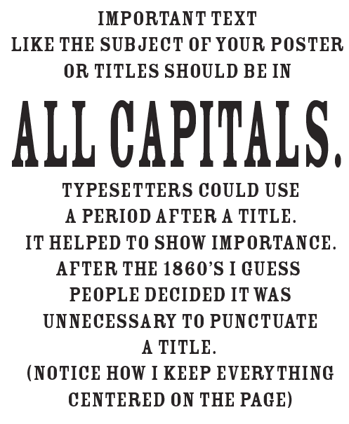
So what are the design rules of 1860's lettering and typesetting? Here I have tried to explain it visually.


I have been meaning to write this post for awhile, and I suppose I should do it before all the excitement about our time period dies down.
As a highly skilled, trained and well-versed expert in my chosen field I studied before this dreaded war, (that of a commercial printer), I have been meaning, no...procrastinating on writing this very helpful journal entry. It's on how to design convincing event flyers and recruiting posters for reenactments and reenacting groups, done in a historically accurate style. To this end, I have compiled this series of infographics if you will, of how to do this yourself using desktop publishing software and free fonts, following the Nineteenth Century "Rules" of design.
Before we start, you will need a desktop publishing program. Microsoft Publisher is adequate, but an Adobe program is better. Adobe gives 100% freedom to push, pull, stretch and resize text without any constraint or size limits. And it has none of that annoying "snap to grid" or "margins" that Microsoft Office does. Luckily, Adobe Illustrator and Photoshop are now available for a monthly subscription fee through Adobe Creative Cloud instead of $2,000 for a permanent license. The unregistered 30-day trials can save documents and have full functionality for one month. Don't forget you can also use alternative free publishing programs like Inkscape (vector drawing program) and GIMP (A poor man's Photoshop). These programs are absolutely free, open-source and user supported. Apache OpenOffice is a free clone of MS Office products.
I wanted to start out this unique post by showing a few historical examples of famous Civil War posters.
The first one everybody's seen. It is a broadside printed for a South Carolina newspaper, nowadays known as a flyer. Look at how huge they printed that headline. The UNION is DISSOLVED!! It's shocking enough to make a young lady faint. It actually would have cost a substantial amount of money to print letters this big. We tend to forget how much more work it was to typeset back then. These type blocks were large and heavy and probably custom made for the job. Obviously, the printer spared no expense in creating this earth-shattering headline that altered the fate of a nation.
Recruiting posters were also printed in ridiculously bold letters to grab young men's attention.

And here's one I like, a recruiting broadside from the Governor of Pennsylvania proclaiming the mustering in of a new infantry regiment. The unit is known as Kane's Rifles, after its colonel Thomas Leiper Kane. This was officially named the 42nd Pennsylvania Infantry, the "old bucktails"...my unit!
If you have an artistic eye, you may notice that these posters seem to break many of the contemporary rules of layout design, notably too many fonts, text that makes your eyes jump around, and looking too "busy".
There were different rules back in those days, and we simply have to get used to them and think like an 1860's person.
Now I will show how YOU TOO can make posters and flyers that look authentic to promote your events or recruit new members to your reenacting unit!
The following fonts have been confirmed as authentic typefaces used during the Civil War.
These fonts are actual historic typefaces which were studied, traced and digitized by modern designers. You may recognize some of them from Harper's Weekly newspapers or recruiting posters, or various other historic places. Chances are you've seen many of these fonts before, but you didn't know what they are called. All the fonts shown above are free and can be downloaded from a font website like www.dafont.com.
For the more serious typesetter who would like to see some really high quality premium Civil War fonts and pay some money, you can click on the link below to be taken to an online store where you can purchase the sets of type. I highly recommend WALDEN FONT CO. as the best source of accurate, very faithfully reproduced historic typefaces.
This next set of free fonts below, while some of them did exist in the 1860's, did not become really popular and come into widespread use until the 1870's and 1880's, when mechanical printing machines and more advanced typesetting techniques were developed, allowing for finer detail.
Use the below fonts sparingly, or as little as possible.

While they might be fancy, I feel these typefaces scream "Wild West" more than anything else. How many times in bad cowboy movies have you seen the lettering styles shown above? The top one, Mesquite Standard, to me says SALOON while the Playbill font second from the bottom is from the stereotyped WANTED: DEAD OR ALIVE $1,000 REWARD posters. These are less appropriate to be used in an 1860's advertisement for this reason, though I'm not saying they didn't exist. These were more likely hand painted on storefront signs and not printed.The bottom one, Rosewood Standard, reminds me of circus shows, or like something to be painted on the side of a bandwagon.
Here is the "Black List" of fonts which should NEVER be used. Many people pick these because they come shipped standard with newer versions of Windows and Microsoft Office. Don't. These fonts are cheap, hackneyed and hideously overused, not to mention non-historical, and I strongly urge you not to use them.
 | ||||||||
So what are the design rules of 1860's lettering and typesetting? Here I have tried to explain it visually.
It's been said that those with the least intelligent things
to say speak the loudest.
to say speak the loudest.
All text layouts should look symmetrical and visually stable.
A general rule when designing 1860's posters is to make the best use of the space you can. Try to cover about 80% of the page. Stretch out lines to fill empty areas, but be sure to leave a 1/2 inch to 1 inch margin on either side.
Here's an example of a flyer I created
using the principles I just discussed.
using the principles I just discussed.

I stretched the rules a little bit, using 6 fonts. But the style and text arrangement is spot on. Recruiting posters tended to separate different pieces of information with black lines.
As for the engravings, as long as you're not stealing a scan of an original document from someone's private collection, Google image search will suffice. The idea of copyright law didn't really come around until Teddy Roosevelt's time, and even for about 20 years after that it was hardly respected. Besides, anything produced 150 years ago is now in the public domain. Don't let anyone tell you otherwise. Nobody can claim ownership of a sketch or an engraving if the person that made it died over 100 years ago, unless they own the actual original document and it is the only one of its kind.
I hope you find this post helpful. Happy pixel-pushing!
Nice post! I know the aesthetic of the '60s are almost opposite of today's minimalism but I'm a fan of both styles.
ReplyDeleteThis comment has been removed by a blog administrator.
ReplyDeleteWell, that’s a good way to put it, nice insights, works great in clientele explanation and information resource option.
ReplyDeleteExhibition Services in UAE